
A Look Inside Cosmetic Packaging Decisions
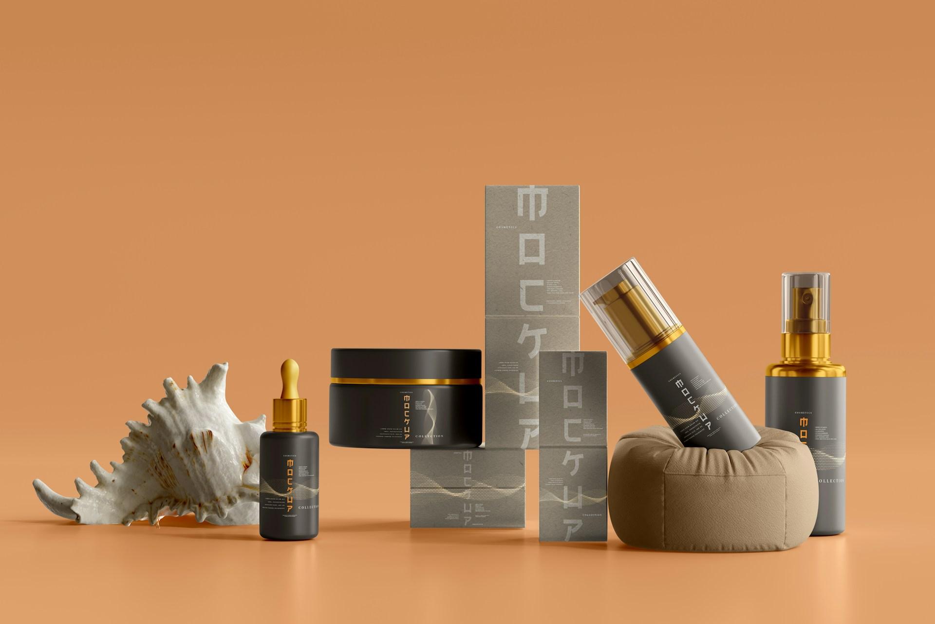
Ask a customer why they picked one mascara over another and they'll often say something vague, like it "looked better" or "seemed nicer." What they're really responding to is a set of details: how easy the label was to read, how the box felt in their hand, whether they could tell the shades apart, and whether the whole thing looked like it came from a brand that knows what it's doing.
Those details are decisions somebody made. Thoughtful cosmetic custom packaging is built from dozens of small choices that shoppers rarely name but almost always feel. This article works through the signals customers pick up on, what each one communicates, and how five common box styles handle them.
Signal 1: Whether the Product Feels Cared For
What shoppers notice: A box that fits snugly, with the product held firmly in place, reads as deliberate. One where the item slides around when picked up reads as careless, even if the product inside is excellent.
This is especially clear with tools. A pair of tweezers works only if the tips meet precisely, so a customer who feels the tool rattling inside its package immediately wonders whether it still works properly.
Tweezer packaging Boxes address this with fitted slots cut into foam or folded board that hold the tool in one position. The tips never press against anything, and the customer's first impression is of a product handled with care. That same box then becomes a storage case, keeping the tool protected between uses and extending the impression well past the sale.
How to get this right:
-
Design inserts around the product's exact shape
-
Shake a packed box; audible movement means the fit needs work
-
Consider whether the box will be kept, and design it to earn that
-
For sets, give each tool its own slot rather than a shared compartment
Signal 2: Whether the Brand Looks Established
What shoppers notice: Products that appear together in an organized unit look like they come from a real brand. Loose items scattered across a shelf look like leftovers.
This matters most in physical retail, where a single lip balm or nail file can vanish among competitors. It matters for the store too: staff need to restock quickly and see at a glance what's running low.
Cosmetic Display packaging Boxes solve this by holding multiple units in a structured arrangement, often with a raised back panel carrying the brand name. The whole collection arrives as one piece and sits on the counter as a small branded world of its own. For shoppers, it signals that this is a considered range rather than a random assortment.
How to get this right:
-
Design displays that set up without tools or assembly time
-
Keep the footprint small enough for crowded counters
-
Make the header panel legible from a few steps away
-
Use slots or tiers so every product stays upright and visible
Signal 3: Whether They Can Find What They Came For
What shoppers notice: How long it takes to identify the exact product they want. Frustration here costs sales, especially for products people buy again and again.
Mascara is the clearest example. Most people settle on a formula and repurchase it for years. They don't want to read four paragraphs to confirm they've got the right one.
Mascara printed Boxes have very little front-panel space, which turns out to be an advantage when used well. One clear message works best: volumizing, lengthening, curling, or waterproof. Many brands assign each formula a distinct accent color, so returning customers spot theirs from across the aisle without reading anything at all.
Everything else, including ingredients, directions, and secondary claims, belongs on the side and back panels where it's available without crowding the front.
How to get this right:
-
Lead with one benefit, not four
-
Use consistent color coding across the range
-
Limit yourself to one or two typefaces
-
Test legibility at arm's length, not on a zoomed-in screen
Signal 4: Whether It Feels Like It's Meant for Them
What shoppers notice: Whether the packaging speaks their language. A product can be well made and well priced and still feel wrong if the design belongs to a different audience.
Men's grooming shows this clearly. A beard oil packaged in soft pastels with delicate script will struggle in a barbershop, no matter how good the formula is.
Beard Oil packaging Boxes typically take a different visual direction: deep colors, textured kraft board, vintage-style emblems, and copper or gold foil. These choices feel at home alongside leather chairs and wood counters. There's a practical layer too, since beard oil usually comes in a glass dropper bottle that needs a fitted insert to stay upright and intact. Printing the scent notes, such as cedar, bergamot, or sandalwood, on the front lets customers choose without unsealing anything.
How to get this right:
-
Look at the shops where your product will be sold, and design for that setting
-
Choose finishes that match your audience's expectations, not just your budget
-
Hold glass bottles upright with a fitted insert
-
Put the information customers actually decide on, like scent, where it's easy to find
Signal 5: Whether the Opening Feels Worth It
What shoppers notice: The moment the box opens. This is where a purchase either feels special or simply feels like a transaction, and it's the moment most likely to be filmed or photographed.
Color cosmetics have the most room to play here. Well-designed eyeshadow paper boxes can carry a palette's theme, whether it's a season, a place, or a mood, across the artwork, shade names, and finishes. A shade map printed on the back lets shoppers preview the colors before buying, which builds confidence online where swatching isn't possible.
The unglamorous half matters just as much. Pressed powder cracks when it shifts, and a cracked palette turns an exciting reveal into a refund request. A snug fit and a cushioning layer are what allow the creative half to land.
How to get this right:
-
Plan the sequence: outside, opening, and what's revealed inside
-
Coordinate interior and exterior colors
-
Add a short message or care tip under the lid
-
Use magnetic or ribbon closures on premium lines
-
Protect fragile pressed products first, then design around that
Signal 6: Whether Anything Feels Off
What shoppers notice: Small errors that undermine trust. A typo, a color that doesn't match the product photo, a lid that sticks, or a box that arrives dented all suggest a brand that isn't paying attention.
Almost all of these are caught by ordering physical samples before a full production run. Place the product inside and shake it. View the printed colors under daylight, store lighting, and a phone camera, since printed shades often differ from what appeared on screen. Ship a few samples to yourself and to a friend in another city. Ask a retailer or a handful of customers for honest reactions.
What to check on a sample:
-
Does the product move inside the box?
-
Are colors accurate and consistent across the run?
-
Is every word spelled correctly and easy to read?
-
Does the box open and close smoothly?
-
Did anything fragile survive delivery?
Fixing a problem at the sample stage costs a fraction of reprinting thousands of boxes.
Signal 7: Whether the Range Hangs Together
What shoppers notice: Whether your products look like they belong to each other. Customers may never say this out loud, but a mismatched range feels less credible than a unified one.
This usually happens by accident. Boxes get designed one at a time as products launch, each with a slightly different color or font, and after two years the shelf looks like several brands sharing a name.
The fix is a simple system: a core palette, one or two typefaces, and consistent logo placement applied across every box style. Individual products can still have their own accents, but the family should be recognizable. It pays off in production too, since consistent specifications are easier to reorder and manage.
How to get this right:
-
Write down your core colors, fonts, and logo placement, and stick to them
-
Let individual products vary by accent, not by whole design language
-
Keep specifications on file for reorders
-
Review the full range together once a year, not product by product
Signal 8: Whether the Claims Hold Up
What shoppers notice: Increasingly, what the box is made of and what happens to it afterward. Customers who care about this read labels closely, and they notice when a claim doesn't match reality.
If sustainability is part of your positioning, choose recyclable board, limit mixed materials that are hard to separate, and print clear disposal guidance. Then confirm the specifics with your supplier before anything goes to print. Foil films, laminates, and plastic windows can all affect whether a box is accepted for recycling, and a well-meaning but inaccurate claim does more damage than saying nothing at all.
A Practical Checklist
Before approving a design, walk through these questions:
-
Does the product sit securely, without movement?
-
Would a shopper identify the product and brand from several steps away?
-
Is the single most important message the most prominent thing on the front?
-
Does the design suit the people and places where it will be sold?
-
Is fragile content genuinely protected, not just attractively presented?
-
Have you tested a physical sample through real shipping?
-
Does this box look like it belongs with the rest of your range?
-
Can every claim on the box be backed up?
Conclusion
Shoppers rarely analyze packaging, but they respond to it constantly. Tweezer boxes show that a secure fit signals care, display boxes show that structure makes a brand look established, mascara boxes show that clarity beats clutter, beard oil boxes show that design has to speak to its audience, and eyeshadow boxes show that protection and presentation depend on each other. When you design around those signals and invest in custom packaging boxes built for your products and your customers, you give shoppers every reason to reach for yours.

 English
 Arabic
 French
 Portuguese
 Deutsch
 Turkish
 Dutch
 Italiano
 Russian
 Romaian
 Portuguese (Brazil)
 Greek